很酷的切换效果 纯CSS3幻灯片实现
Sponsor
CSS3实现给我们带来太多惊喜,FLASH能实现的动画,很多CSS3也可以实现,正如今天为大家展示的纯HTML/CSS的幻灯片,无jQuery代码就可以实现流畅的切换效果,而且很酷很漂亮哦!

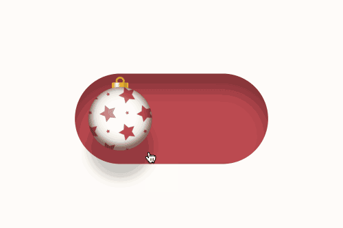
这个CSS3幻灯片使用了单选按钮radio来实现图片的切换,下面是一个Gif动画展示这个Slider,为了减少图片大小,被我压缩了图片大小和质量,实现在网页上展示是很流畅的。
你也可以查看在线版DEMO:radio click through
HTML/CSS代码
大家可以直接复制下面这些代码来研究或使用这个CSS幻灯片,记住是要支持CSS3的浏览才能看到效果哦!
CSS代码
*, *:before, *:after {
  margin:0;
  padding:0;
  -webkit-box-sizing:border-box;
  -moz-box-sizing:border-box;
  box-sizing:border-box;
}
#gal {
  position:relative;
  width:600px;
  height:300px;
  margin:0 auto;
  top:100px;
  background:white;
  -webkit-box-shadow:0px 0px 0px 10px white,
             5px 5px 0px 10px rgba(0,0,0,0.1);
  -moz-box-shadow:0px 0px 0px 10px white,
             5px 5px 0px 10px rgba(0,0,0,0.1);
  box-shadow:0px 0px 0px 10px white,
             5px 5px 0px 10px rgba(0,0,0,0.1);
  -webkit-transform:translate3d(0, 0, 0);
  -moz-transform:   translate3d(0, 0, 0);
  -ms-transform:    translate3d(0, 0, 0);
  -o-transform:     translate3d(0, 0, 0);
  transform:        translate3d(0, 0, 0);
}
#gal:after {
  content:'';
  position:absolute;
  bottom:24px;
  right:0;
  left:0;
  width:100%;
  height:1px;
  background:rgba(255,255,255,0.35);
  z-index:3;
}
#gal ul {list-style-type:none;}
input[type="radio"], input[type="radio"] + label {
  position:absolute;
  bottom:15px;
  display:block;
  width:20px;
  height:20px;
  -webkit-border-radius:50%;
  -moz-border-radius:50%;
  border-radius:50%;
  cursor:pointer;
}
input[type="radio"] {
  opacity:0;
  z-index:9;
}
input[value="one"], input[value="one"] + label {left:20px;}
input[value="two"], input[value="two"] + label {left:128px;}
input[value="three"], input[value="three"] + label {left:236px;}
input[value="four"], input[value="four"] + label {left:344px;}
input[value="five"], input[value="five"] + label {left:452px;}
input[value="six"], input[value="six"] + label {right:20px;}
input[type="radio"] + label {
  background:rgba(255,255,255,0.35);
  z-index:7;
  -webkit-box-shadow:0px 0px 0px 0px rgba(255,255,255,0.15);
  -moz-box-shadow:0px 0px 0px 0px rgba(255,255,255,0.15);
  box-shadow:0px 0px 0px 0px rgba(255,255,255,0.15);
  -webkit-transition:all .3s;
  -moz-transition:all .3s;
  -o-transition:all .3s;
  transition:all .3s;
}
[class*="entypo-"]:before {
  position:absolute;
  font-family: 'entypo', sans-serif;
}
figure[class*="entypo-"]:before {
  left:10px;
  top:5px;
  font-size:2rem;
  color:rgba(255,255,255,0);
  z-index:1;
  -webkit-transition:color .1s;
  -moz-transition:color .1s;
  -o-transition:color .1s;
  transition:color .1s;
}
a[class*="entypo-"]:before {
  top:8px;
  left:9px;
  font-size:1.5rem;
  color:white;
}
a:hover[class*="entypo-"]:before {
  color:white;
}
figure, figure img, figcaption {
  position:absolute;
  top:0;
  right:0;
}
figure {
  bottom:0;
  left:0;
  width:600px;
  height:300px;
  display:block;
  overflow:hidden;
}
figure img {
  bottom:0;
  left:0;
  display:block;
  width:600px;
  height:300px;
  z-index:1;
  -webkit-transform:translateX(600px);
  -moz-transform:translateX(600px);
  -ms-transform:translateX(600px);
  -o-transform:translateX(600px);
  transform:translateX(600px);
  -webkit-transition:all .15s .15s, z-index 0s;
  -moz-transition:all .15s .15s, z-index 0s;
  -o-transition:all .15s .15s, z-index 0s;
  transition:all .15s .15s, z-index 0s;
}
figcaption {
  display:block;
  width:270px;
  height:300px;
  padding-top:20px;
  background-image:radial-gradient(rgba( 255,255,255,0.3), transparent);
  background-size:600px 600px;
  background-repeat:no-repeat;
  background-position:-300px -150px;
  text-align:center;
  z-index:3;
  -webkit-box-shadow:-5px 0px 20px rgba(0,0,0,0.1);
  -moz-box-shadow:-5px 0px 20px rgba(0,0,0,0.1);
  box-shadow:-5px 0px 20px rgba(0,0,0,0.1);
  -webkit-transform:translateX(300px);
  -moz-transform:translateX(300px);
  -ms-transform:translateX(300px);
  -o-transform:translateX(300px);
  transform:translateX(300px);
  -webkit-transition:all .35s;
  -moz-transition:all .35s;
  -o-transition:all .35s;
  transition:all .35s;
}
h4 {
  display:inline-block;
  padding:0 15px;
  color:white;
  font-family: 'Titillium Web', sans-serif;
  font-weight:300;
  font-size:2rem;
}
figcaption nav ul {display:block;padding-top:10px;}
figcaption nav ul li {display:inline-block;margin-left:5px;}
figcaption nav ul li a {
  position:relative;
  display:block;
  width:40px;
  height:40px;
  background:rgba(255,255,255,0.2);
  text-decoration:none;
  color:white;
  -webkit-border-radius:50%;
  -moz-border-radius:50%;
  border-radius:50%;
  -webkit-box-shadow:inset 0px 0px 0px 0px rgba(255,255,255,0);
  -moz-box-shadow:inset 0px 0px 0px 0px rgba(255,255,255,0);
  box-shadow:inset 0px 0px 0px 0px rgba(255,255,255,0);
  -webkit-transition:all .15s;
  -moz-transition:all .15s;
  -o-transition:all .15s;
  transition:all .15s;
}
figcaption nav ul li a:hover {
  background:rgba(255,255,255,0);
  -webkit-box-shadow:inset 0px 0px 0px 2px rgba(255,255,255,1);
  -moz-box-shadow:inset 0px 0px 0px 2px rgba(255,255,255,1);
  box-shadow:inset 0px 0px 0px 2px rgba(255,255,255,1);
}
figcaption p {
  padding:50px 15px;
  font-family:'Titillium Web', sans-serif;
  font-weight:300;
  color:#333;
  background-image:-webkit-gradient(linear, 0 0, 0 100%, from(rgba(255,255,255,0.35)), color-stop(0.3, rgba(255,255,255,0.35)), color-stop(0.3, transparent), color-stop(0.7, transparent), color-stop(0.7, rgba(255,255,255,0.35)), to(rgba(255,255,255,0.35)));
  background-image:-webkit-linear-gradient(rgba(255,255,255,0.35) 0%, rgba(255,255,255,0.35) 30%, transparent 30%, transparent 70%, rgba(255,255,255,0.35) 70%, rgba(255,255,255,0.35) 100%);
  background-image:-moz-linear-gradient(rgba(255,255,255,0.35) 0%, rgba(255,255,255,0.35) 30%, transparent 30%, transparent 70%, rgba(255,255,255,0.35) 70%, rgba(255,255,255,0.35) 100%);
  background-image:-o-linear-gradient(rgba(255,255,255,0.35) 0%, rgba(255,255,255,0.35) 30%, transparent 30%, transparent 70%, rgba(255,255,255,0.35) 70%, rgba(255,255,255,0.35) 100%);
  background-image:linear-gradient(rgba(255,255,255,0.35) 0%, rgba(255,255,255,0.35) 30%, transparent 30%, transparent 70%, rgba(255,255,255,0.35) 70%, rgba(255,255,255,0.35) 100%);
  background-size:1px 100%;
  background-repeat:no-repeat;
  background-position:50% 0%;
}

input[type="radio"]:hover + label {
  background:rgba(255,255,255,0.6);
}
input[type="radio"]:checked + label {
  background:rgba(255,255,255,1);
  -webkit-box-shadow:0px 0px 0px 5px rgba(255,255,255,0.3);
  -moz-box-shadow:0px 0px 0px 5px rgba(255,255,255,0.3);
  box-shadow:0px 0px 0px 5px rgba(255,255,255,0.3);
}
input[type="radio"]:checked + label:before {}
input[type="radio"]:checked ~ figure img {
  z-index:2;
  -webkit-transform:translatex(0px);
  -moz-transform:translatex(0px);
  -ms-transform:translatex(0px);
  -o-transform:translatex(0px);
  transform:translatex(0px);
  -webkit-transition:all .15s, z-index 0s;
  -moz-transition:all .15s, z-index 0s;
  -o-transition:all .15s, z-index 0s;
  transition:all .15s, z-index 0s;
}
input[type="radio"]:checked ~ figure[class*="entypo-"]:before {
  z-index:3;
  color:rgba(255,255,255,0.5);
  -webkit-transition:color .5s;
  -moz-transition:color .5s;
  -o-transition:color .5s;
  transition:color .5s;
}
input[type="radio"]:checked ~ figure figcaption {
  z-index:8;
  -webkit-transform:translateX(0px);
  -moz-transform:translateX(0px);
  -ms-transform:translateX(0px);
  -o-transform:translateX(0px);
  transform:translateX(0px);
  -webkit-transition:all .35s, .7s;
  -moz-transition:all .35s, .7s;
  -o-transition:all .35s, .7s;
  transition:all .35s, .7s;
}
h2 {
  margin-top:150px;
  text-align:center;
  font-family: 'Titillium Web', sans-serif;
  font-weight:300;
  font-size:1.2rem;
}
h2 a {
  position:relative;
  color:tomato;
  text-decoration:none;
}
h2 a:after {
  content:'';
  position:absolute;
  bottom:-2px;
  left:0;
  width:0;
  height:1px;
  background:tomato;
  -webkit-transition:width .1s;
  -moz-transition:width .1s;
  -o-transition:width .1s;
  transition:width .1s;
}
h2 a:hover:after {
  width:100%;
}
body {background:#f0f0f0;}
html, body {
  width:100%;
  height:100%;
}
HTML代码
<div id="gal">
<nav class="galnav">
<ul>
<li>
<input type="radio" name="btn" value="one" checked="checked"/>
<label for="btn"></label>
<figure>
<img src="image.jpg"/>
<figcaption>
<h4>小标题</h4>
<nav role='navigation'>
<p>段落</p>
<ul>
<li>列表文字</li>
<li>列表文字</li>
</ul>
</nav>
</figcaption>
</figure>
</li>
<li>
<input type="radio" name="btn" value="two"/>
<label for="btn"></label>
<figure class="entypo-forward">
<img src="image.jpg"/>
<figcaption>
<h4>小标题</h4>
<nav role='navigation'>
<p>段落</p>
<ul>
<li>列表文字</li>
<li>列表文字</li>
</ul>
</nav>
</figcaption>
</figure>
</li>
。。。
。。。
</ul>
</nav>
</div>
其实CSS3还能制作很多你意想不到的动画效果,所以发挥你的创意,让动画飞起来……
赞助商链接

与 CSS3 相关的文章

喜欢这篇文章吗?欢迎分享到你的微博、QQ群,并关注我们的微博,谢谢支持。
版权:除非注明,本站文章均为原创文章,转载请联系我们授权,否则禁止转载。
版权:除非注明,本站文章均为原创文章,转载请联系我们授权,否则禁止转载。
+ 添加评论4 Responses to “很酷的切换效果 纯CSS3幻灯片实现”
{ 发表评论 }
推荐书籍
-
 艺术的故事艺术与审美入门之书
 -
 DON'T MAKE ME THINK设计师必看
 -
 《移动应用UI设计模式》手机APP设计
 -
 《设计心理学 全四册》高阶技能!
 -
 JavaScript权威指南(第5版)只能说牛X
 -
 《见微知著》Web用户体验入门书籍
赞助商
很漂亮!
不错的效果~
好腻害!
很不错的效果,要是也提供向下兼容的解决方案就更好了