CSS精灵优化Retina显示屏下的网站图像
Sponsor
Retina Display的出现有好有坏吧,坏处就是我们设计师要多做一份@2x版本的图像,如果不做的话在Retina显屏下会模糊。既然要做2份了,哪么我们可以利用CSS精灵(css sprites)来优化一下,CSS 精灵我想很多已经使用这项技术,具体制作过程网上有很多,本文主要讲如何用CSS精灵来优化Retina显示屏下的网站图像。
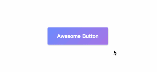
准备好图像
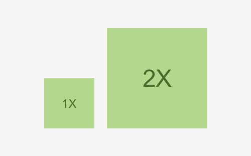
左边是普通图像,右边是Retina的图像(@2x)。

HTML代码:
<span class="location">location</span>
<span class="success">success</span>
<span><a class="delete">delete</a></span>
<span class="content"><a class="fav-link">fav-link</a></span>
使用独立图片写法
- location.png
- success.png
- delete.png
- favorite.png
- location@2x.png
- success@2x.png
- delete@2x.png
- favorite@2x.png
CSS代码:
span.location {
	background: url(location.png) no-repeat 0 0;
}

span.success {
	background: url(success.png) no-repeat 0 0;
}

a.delete {
	background: url(delete.png) no-repeat 0 -100px;
}

.content a.fav-link {
	background: url(favorite.png) no-repeat 0 0;
}

@media only screen and (-webkit-min-device-pixel-ratio: 2),
only screen and (min-device-pixel-ratio: 2) {
	span.location {
		background-image: url(location@2x.png);
		background-size: 16px 14px;
	}

	span.success {
		background-image: url(success@2x.png);
		background-size: 13px 14px;
	}

	a.delete {
		background: url(delete@2x.png) no-repeat 0 -100px;
	}

	.content a.fav-link {
		background-image: url(favorite@2x.png);
		background-size: 11px 13px;
	}
}
使用CSS精灵写法
- sprite.png
- sprite@2x.png
CSS代码:
span.location {
	background: url(sprite.png) no-repeat 0 0;
}

span.success {
	background: url(sprite.png) no-repeat -100px 0;
}

a.delete {
	background: url(sprite.png) no-repeat -100px -100px;
}

.content a.fav-link {
	background: url(sprite.png) no-repeat 0 -100px;
}

@media only screen and (-webkit-min-device-pixel-ratio: 2),
only screen and (min-device-pixel-ratio: 2) {
	span.location,
	span.success,
	a.delete,
	.content a.fav-link {
		/* Reference the @2x Sprite */
		background-image: url(sprite@2x.png);
		/* Translate the @2x sprite's dimensions back to 1x */
		background-size: 200px 200px;
	}
}
判断为Retina显示屏的JS
我们可以能过[code]window.devicePixelRatio[/code]来判断是否为Retina显示屏。
JavaScript
[javascript]
if(window.devicePixelRatio == 2){
//for Retina Display
}
[/javascript]
不需要制作@2X版本图片的解决方案
如果你觉得为了支持Retina显示而制作两个图像版本是件很麻烦的事情,哪么你可以参考《Retina 显示屏下 @2x 图片的模拟》这篇文章。
赞助商链接

与 CSS3 相关的文章

喜欢这篇文章吗?欢迎分享到你的微博、QQ群,并关注我们的微博,谢谢支持。
版权:除非注明,本站文章均为原创文章,转载请联系我们授权,否则禁止转载。
版权:除非注明,本站文章均为原创文章,转载请联系我们授权,否则禁止转载。
{ 发表评论 }
推荐书籍
-
 艺术的故事艺术与审美入门之书
 -
 DON'T MAKE ME THINK设计师必看
 -
 《移动应用UI设计模式》手机APP设计
 -
 《设计心理学 全四册》高阶技能!
 -
 JavaScript权威指南(第5版)只能说牛X
 -
 《见微知著》Web用户体验入门书籍

赞助商